B2C SaaS
UX Optimisation
Mobile Responsive
IA
UX + UI Design
Design System
Brand Positioning + Identity
Usability Testing & Iteration
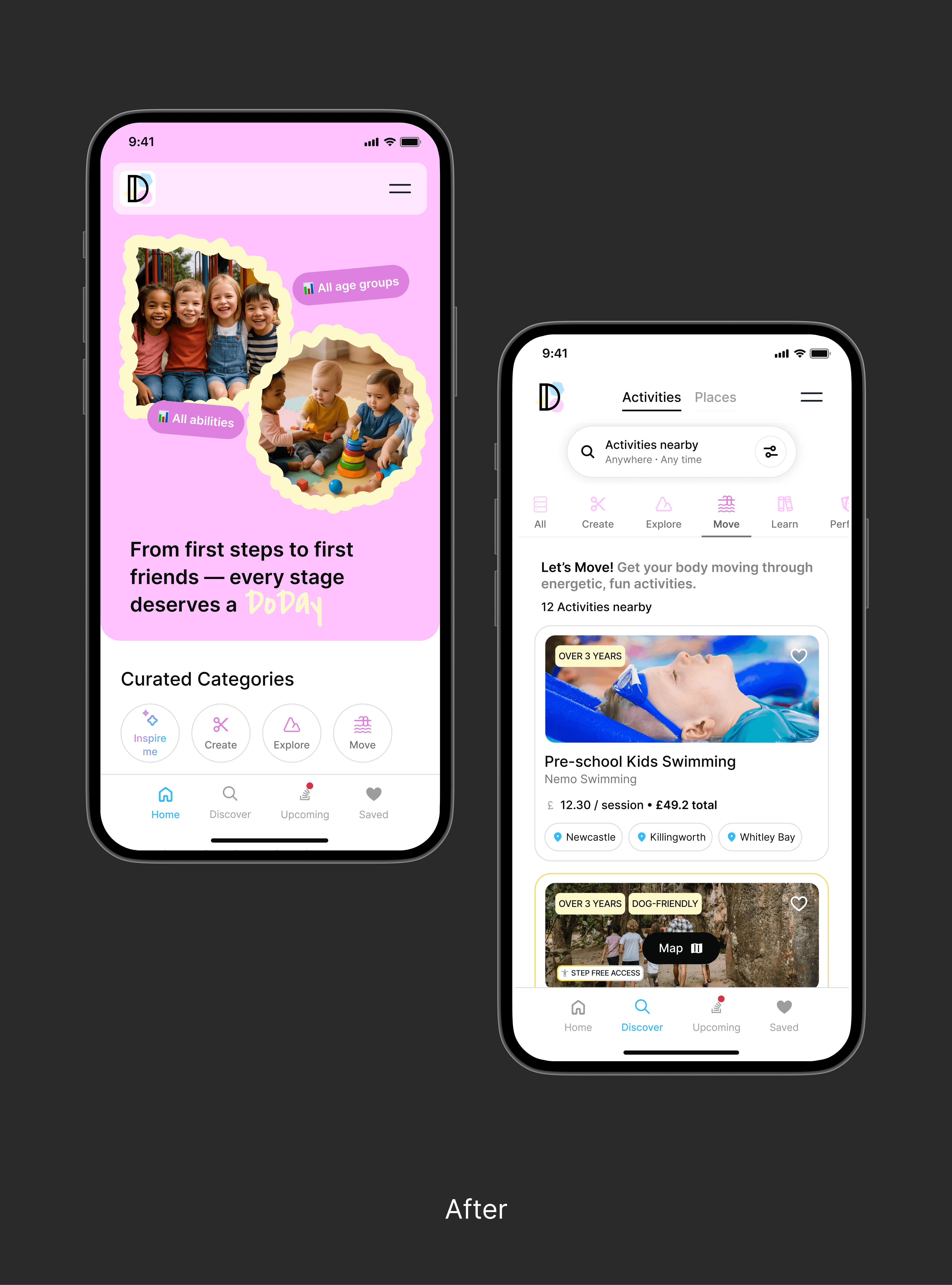
Redesigned a mobile-first discovery experience for DoDays, a children's activity marketplace, focusing on simplifying activity discovery, increasing engagement and retention, while supporting platform's long term growth with a new scalable design system. The new UX differentiates the brand from competitors while positioning it as an accessibility advocate for children's diverse needs.
Timeframe
2025 / 16 weeks
Client/Industry
DoDays / Leisure
My Role
Team
UK National Innovation Centre for Ageing
1 Product Owner and Developer, 1 UX/UI Designer, 1 Design Intern, 1 Data Analyst
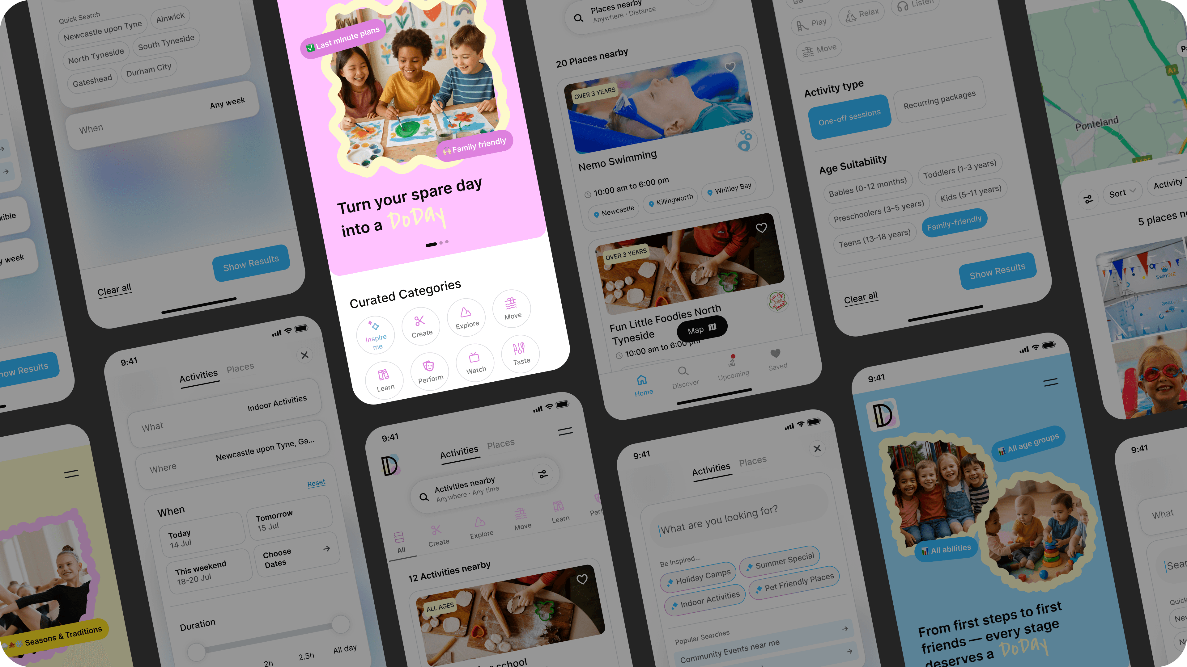
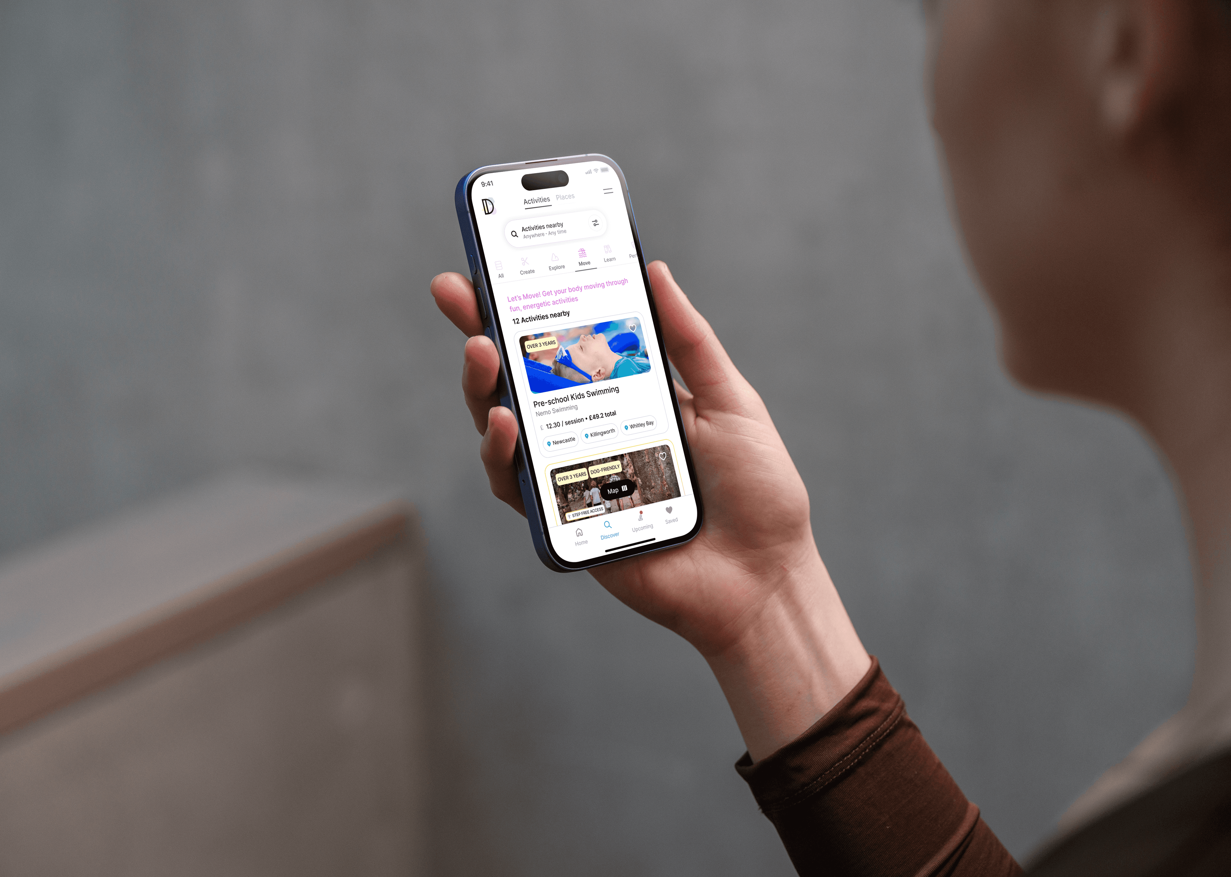
Mobile-first responsive (Shipped in Apr 2026)
Native app release (2027)
IN PROGRESS
Shipped Design
72%
Adoption
Users discovered activities from new entry points on home.
Shipped Design
+11%
Discovery Conversion
Shipped Design
-25%
Time-to-value
The new UX shortened the time to find a relevant activity by ~5 mins per session
Usability Testing
15/15
testers reported higher satisfaction. CSAT score is 89.
Discovery
Execution
Goals + North Star
👉🏻 To design a more engaging user experience to make activity discovery intuitive, relevant and efficient for customers
👉🏻 Mobile-first design since 82% of customers used the platform on mobile
👉🏻 Simplify information density with a clear visual hierarchy and surface the right information at the right time
👉🏻 Establish a modern visual language and a scalable design system
👉🏻 Make the brand positioning unique
Process + Key Insights
Listening to data + Understanding the problem
👉🏻 I started with heuristics evaluation and partnered with the data analyst to understand platform's usage analytics.
Quantitative Insights
Drop-offs
72% of the drop-offs were happening at discovery screen if a relevant activity or information wasn't found.
Search filters
"Ability" filter was the least used search filter.

Time to relevancy
Time to find a relevant activity was upto ~20 mins for longer sessions and under 5 mins for repeat bookings.
Time to relevancy
Overall, the platform suffered from high user churn and low conversions
Key Findings from Heuristics
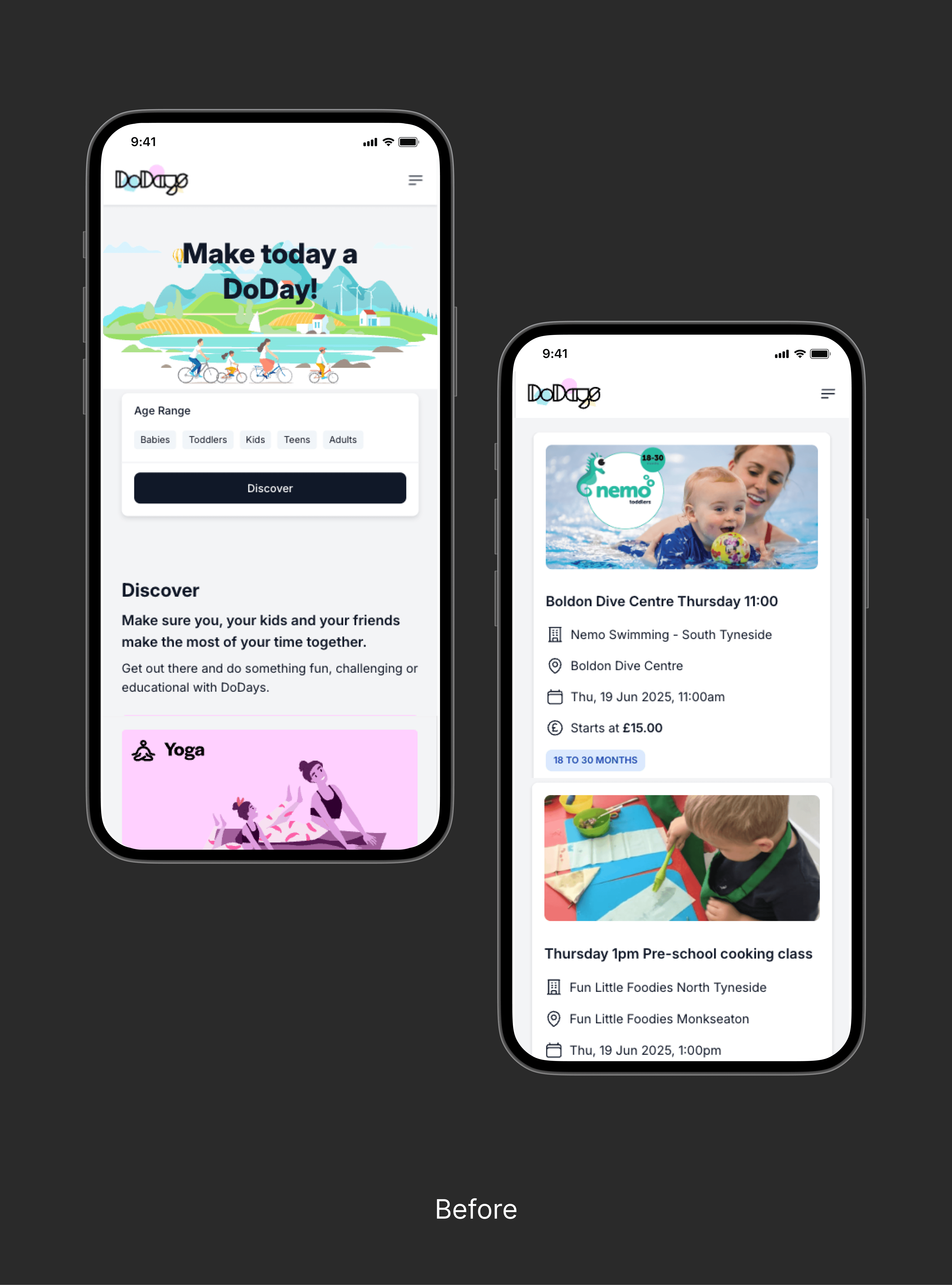
(Old) Home Screen
High user effort, low value
The home fails to inspire and guide users into targeted journeys
• Home screen provided two entry points - discover activities by age groups or activity type. This only helped users who know exactly what they want, not the ones who are exploring options with low intent.
• Long vertical scrolling on mobile becomes poor user experience
• Random mix of activities displayed
• The hero doesn't offer the brand's unique value.
Linear entry point
Activity-led journeys
Lacks consistency
Long vertical scroll

Time-consuming Search
Drowning in options and starving for relevance
• Discovery screen presented an inefficient search bar with long, unstructured filters that caused repetitive listings.
• Weak visual hierarchy on activity cards made information hard to scan or compare, which led to slow decisions. For busy parents, saving time is critical and this inefficient discovery made it hard to find relevant activities quickly.
Fragmented Discovery
Weak Visual Hierarchy
Unstructured filters
Slow decision-making
(Old) Discover Screen
👉🏻 Next conducted in-person focus groups with existing customers to map their activity discovery flow and uncover pain points, and partnered with engineers to understand the technical constraints shaping the experience.
Qualitative Insights
Two distinct user needs
Discovering activities wasn't just an efficiency problem. Some users knew what they want, but many needed the platform to inspire them and find an activity that feels right. This was completely missing from the UX as it only focused on age group and activity type.
"Ability" filter is misleading
Limiting activities based on a child's ability in growing years felt discouraging. Functionally, customers found it inefficient - "toddlers would be beginners in most activities".
Accessibility
No platform currently helps people to find more about accessible activities or venues, whether that's more children or their grandparents accompanying them. This was a genuine gap and something that can help DoDays brand stand out from its competitors.
👉🏻 I partnered with Product Owner to define UX Strategy. We aligned strategic goals with key user needs gathered from research and data insights.
Vision
"Transition from the linear, rigid paths into user journeys with multiple entry points that encourage exploration and accommodate for accessibility needs."
Success mterics
• Improve perceived ease of use, reduce time to relevance
• Increase engagement on home screen
• Reduce drop-off rates on the search
Goal
• Improve the activity discovery experience
• Increase the number of users booking activity
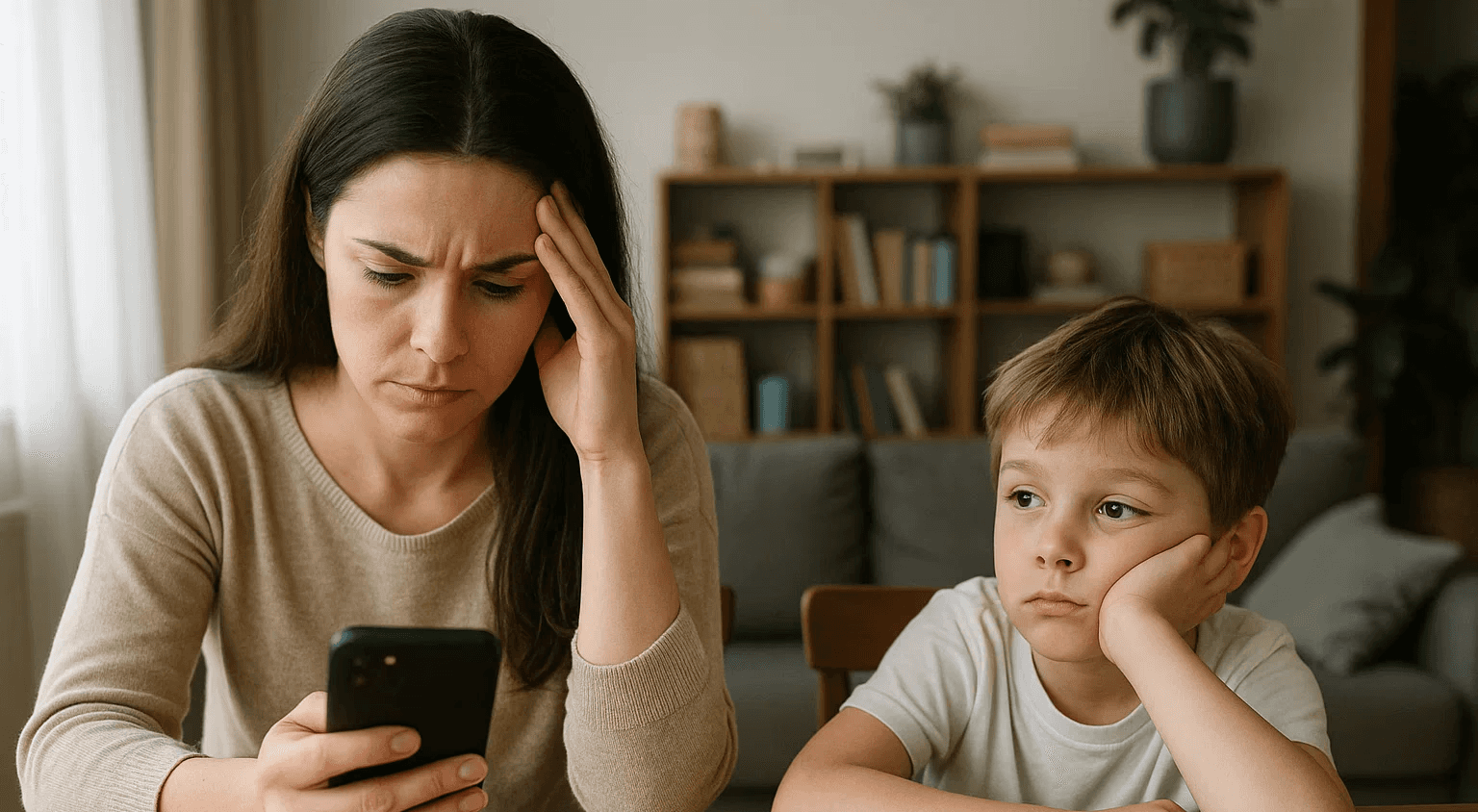
Cognitive load in navigating a fragmented UX with choice overload is a real bottleneck.
Targeting two key customer personas
📌
Prioritising Core User Flows
The findings clearly signalled that the success of design isn't just about building a well-architected activity list; but the UX/UI design needs to support two core mental models: Open-ended and search-driven discovery.
Open-ended Discovery Flow
Imagine a parent using the platform with undefined or loosely defined activity in mind. They rely on the platform to inspire them so they can think in outcomes.
User Scenario: A parent wants ideas to make their child active but does not know what activity would be suitable yet.
Translating into Design Challenge
How might we inspire users to browse more activities when they don't know what they want?
Suggested Design enhancements
👉🏻 Browse through multiple curated collections on home screen
👉🏻 Relevancy by age groups, interests, location, immediacy
👉🏻 Clear visual hierarchy on activity cards to highlight essential information
Search-driven Flow
Imagine a parent using the platform with a specific activity or goal in mind, but typically have limited time to evaluate options. They rely on quick search and filters to find accurate results and make a booking.
User Scenario: A user is finding nearby swimming lessons for their child and want to know if there are any wheelchair-friendly places for themselves. [keyword search + location + accessible facilities filter ]
Translating into Design Challenge
👉🏻 How might we guide users who know what they want to quickly find relevant activities?
Suggested Design enhancements
👉🏻 Emphasis on search, structured filtering and precise results
👉🏻 Activity cards help to compare age, location, accessibility, price
👉🏻 Clear visual hierarchy on activity cards to highlight and compare essential information